Analysis of Student Learning
= Exceeds
= Meets
= Partially Meets
= Not met
Record Keeping and Feedback

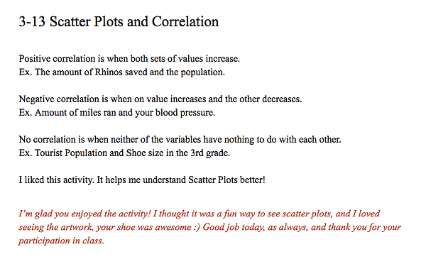

This is an example of a journal entry made by a student after the lesson on scatter plots. The prompt was to describe the three types of correlation and give an example of each. The students are then free to leave comments or questions. I respond immediately after the entry with feedback and something positive about either their entry, participation, or behavior in class that day. By praising specific, positive behaviors, students are more likely to repeat those behaviors in class. The journals are very informal and the students have commented on how they appreciate the feedback. I use the journals mainly to check for understanding, gauge the success of the lesson, and figure out what I can do better next time.
Students' math journals became my main form of offering feedback. They used an ongoing Google Doc that was shared with me in which I could respond to prompts. In math, students generally receive their work back with just a grade written on the top, and occasionally there are corrections made to their work. For students, this really does not tell them much about their strengths and their participation in class. The Google Docs worked for this purpose, but I would like to find another way to create digital math journals that allows this type of communication between myself and my students.
To manage grades, Madison Jr. High School uses Rediker's Teacher Plus Gradebook. It is a web-based portal where we can enter student grades, view student data, write comments, and monitor proficiency. It is very practical, organized, and simple to use. I often used the program to reference students' grades and analyze their performance. While am glad that I had the opportunity to work with the system as it is similar to what many schools use, it is not my number one choice when it comes to giving students feedback. Ultimately, it was best used for monitoring proficiency and what students still owed me.
Narrative
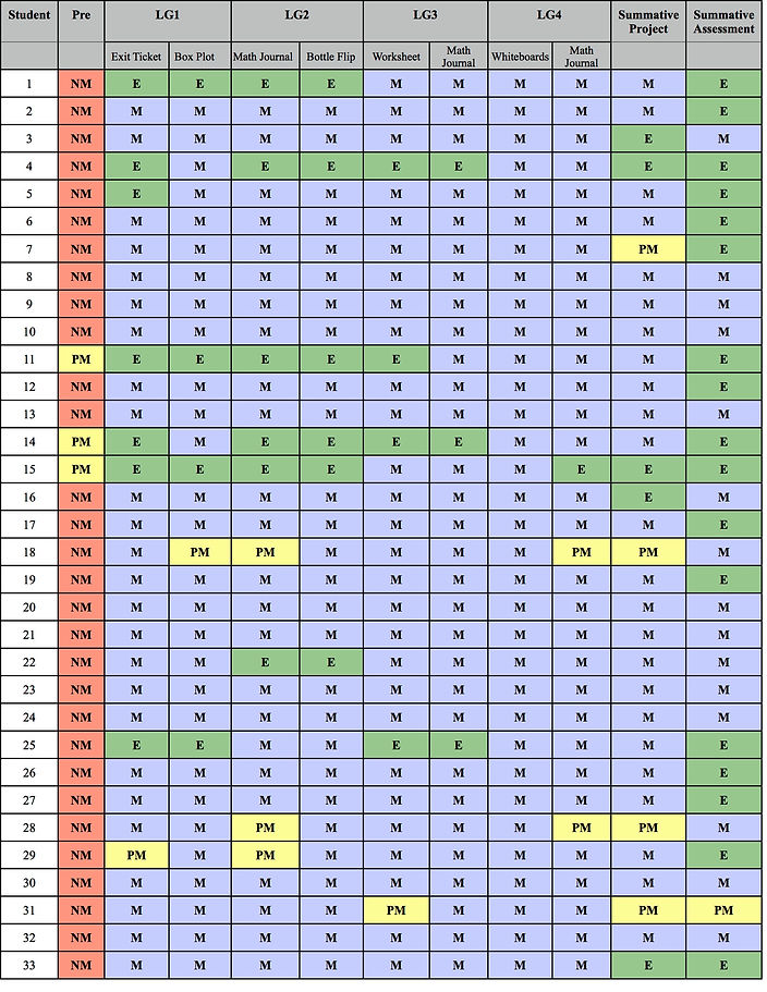
Based solely on student proficiency and assessment results, it is evident that all of my students experienced tremendous growth throughout my unit. Almost all students met the target for each learning goal and the expectations for their summative projects and assessment. Aside from assessment results, there was continual evidence of student learning that I observed through daily conversations. Students frequently asked questions about the material and showed a genuine interest in it. While this is not documented evidence, question asking is a strong indicator of growth, learning, and understanding.
Looking at students' overall performance on the pre-assessment, it is evident that students had very little understanding of univariate and bivariate data displays. Only three students partially met the learning goals, while the rest did not meet them at all. The results from the pre-assessment showed that students needed instruction mostly on histograms, stem and leaf plots, box plots, and scatter plots.
Learning Goal 1
Students will be able to display univariate data graphically using bar graphs, histograms, stem and leaf plots, line graphs, and box plots.
The results of this learning goal prove that instruction was effective. Displaying univariate data was one area on the pre-assessment in which most students did not meet the expectations. The exit ticket that students completed explicitly required them to create different types of graphs from given sets of data, and the box plot activity had students practicing constructing multiple box plots. Only one student for each assessment partially met the learning goal, while the rest of the students either met or exceeded the expectations. This shows a large amount of growth for each student.
Learning Goal 2
Students will be able to read, analyze, and interpret graphic representations of data in relation to their context.
On the pre-assessment, all students were able to correctly read and answer questions about the bar graph. Since students have had practice with bar graphs before, I was more interested in how students would do with reading other types of graphs. As mentioned, students struggled primarily with understanding stem and leaf plots, histograms, and box plots. All students met the learning goal through the box plot activity, and only a few students partially met the learning goal in their math journal entry, with the rest either meeting or exceeding. Students quickly caught on with how to read univariate data displays and that is evident with the assessment results.
Learning Goal 3
Students will be able to construct and interpret scatter plots measuring bivariate data.
All students were immediately able to understand how to construct scatter plots once I explained that it was similar to graphing ordered pairs. Making that connection was the difference for almost all of the students, as very few made any attempt on the pre-assessment to make a scatter plot. All students met the learning goal for their math journal entry, and all but one met the learning goal with the worksheet.
Learning Goal 4
Students will recognize and describe patterns of association between quantitative data sets.
When looking at scatter plots, all students were able to understand whether there was a positive correlation, a negative correlation, or no correlation. The only time that students struggled was when they were asked to predict the relationship between two variables. Once I walked students through a method of inquiry in which they had to identify the variables and determine how one reacts while the other increases, most students were able to accurately predict correlations.
The results of the summative project show that most students understood what was needed to construct scatter plots. For the few students who did not meet the expectation, I believe that it was a matter of being able to find appropriate data sets for their topic. I should have been more clear about what information is needed to make a scatter plot and how it is used to compare quantitative data. Some students used "years" as a variable, creating a line graph as opposed to a scatter plot.
For the summative assessment, I gave an almost identical version of the pre-assessment. Comparing the results from the two, all of my students showed incredible improvement. I was very impressed by how many students exceeded the expectations. The assessment averages were very high and prove that students have a good understanding of univariate and bivariate displays.
Pre-Assessment Averages:
A Group: 47.14%
B Group: 35.85%
C Group: 24.83
Total average: 38.63%
Summative Assessment Averages:
A Group: 95.36%
B Group: 93.46%
C Group: 89.33%
Total average: 92.72%
Average Growth:
A Group: 48.22%
B Group: 57.61%
C Group: 64.5%
Total average: 56.78%